
AviviD.ai Customer Studio
A B2B SaaS platform to streamline audience segmentation.
Project Details
Timeline: November 2024- June 2025 (7 Months)
Role: Product Designer @ AviviD.ai
Team: Worked with marketers, clients, PM, data engineers & received critiques from two other designers
Project Overview
Despite its extensive list of media partners, Avivid.ai struggles to attract advertisers seeking an all-in-one audience segment platform. Without industry insights, segment exploration, and seamless activation, advertisers are hesitant to move from well-established competitors to our platform.
Current Process
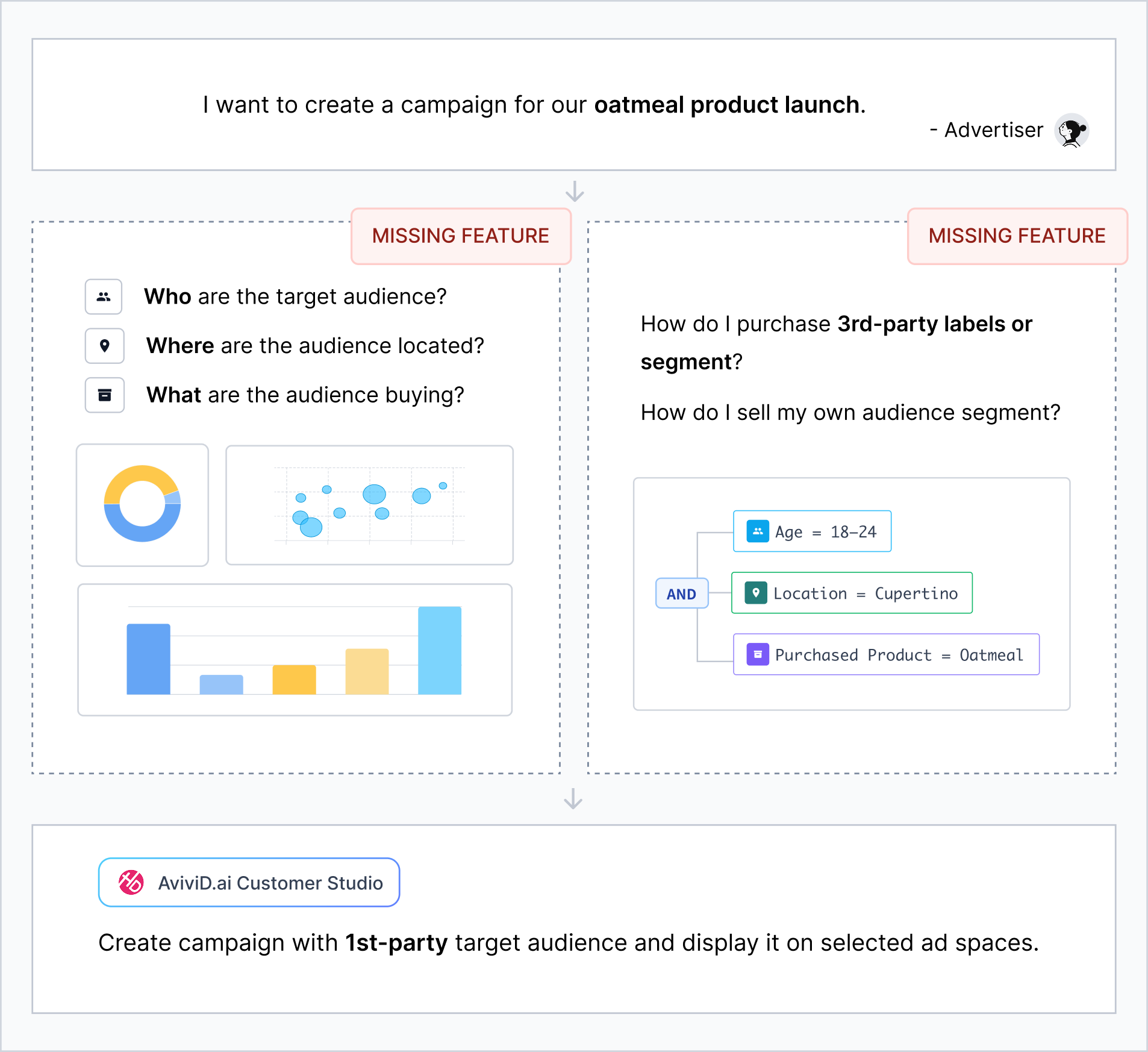
Currently, our users (advertisers) are limited to using their own 1st-party audience segments for campaigns made on our Customer Studio Platform. As a result, advertisers can only target the same group of customers, meaning that they cannot extend the reach of their campaigns.
Moreover, our users utilize external tools to analyze trends and receive actionable insights. However, these tools do not integrate well with our platform, making it difficult to create campaign on our platform and targeting the right audience.
User Journey
Since I have easy access to our in-house advertisers, I discussed my plan of conducting user research with our PM. I received approval to interview 5 of them - three of whom utilize 1st-party data, while the other two purchase 3rd-party data. I created the visualization to illustrate the frustrations during their user journey. To highlight core pain points, I consolidated them into three insights as shown below.


Design Problem

Synthesis - Kano Chart
After defining the design problem, I realized the project scope was too broad to design effectively. After aligning with the PM, I introduced a new approach—surveying users on a set of proposed features and mapping the results to a Kano chart. I gathered 11 responses from experienced users and evaluated how each feature would impact their workflow. This helped us clearly identify which features to prioritize.

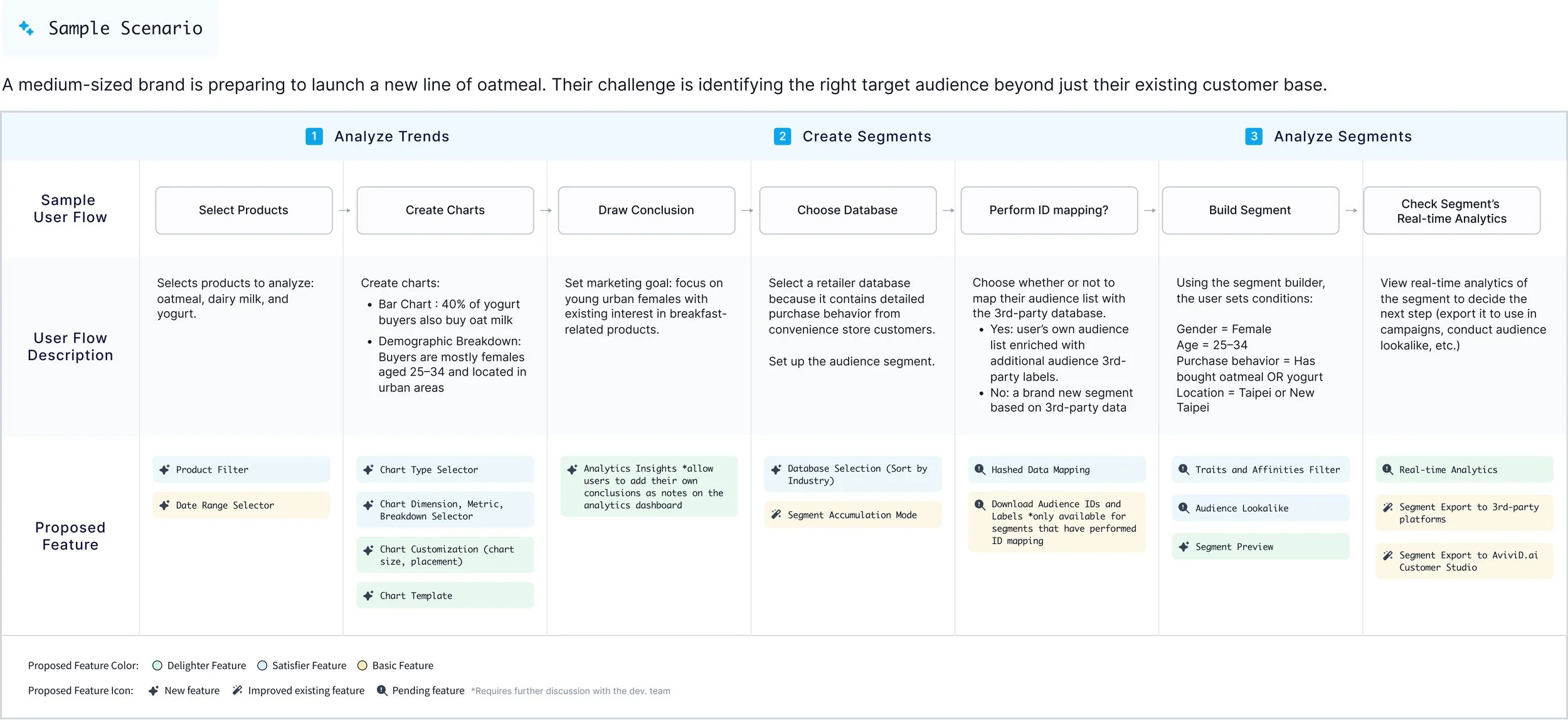
Synthesis - Flow Chart with Potential Features
In order to simulate how users would utilize our platform during the marketing process, I designed a scenario and created a sample user flow that includes proposed features. I made sure to prioritize the “Satisfier” and “Basic” features marked in the Kano chart, while keeping in mind the “Delighter” features and adding them to the flow when I could.

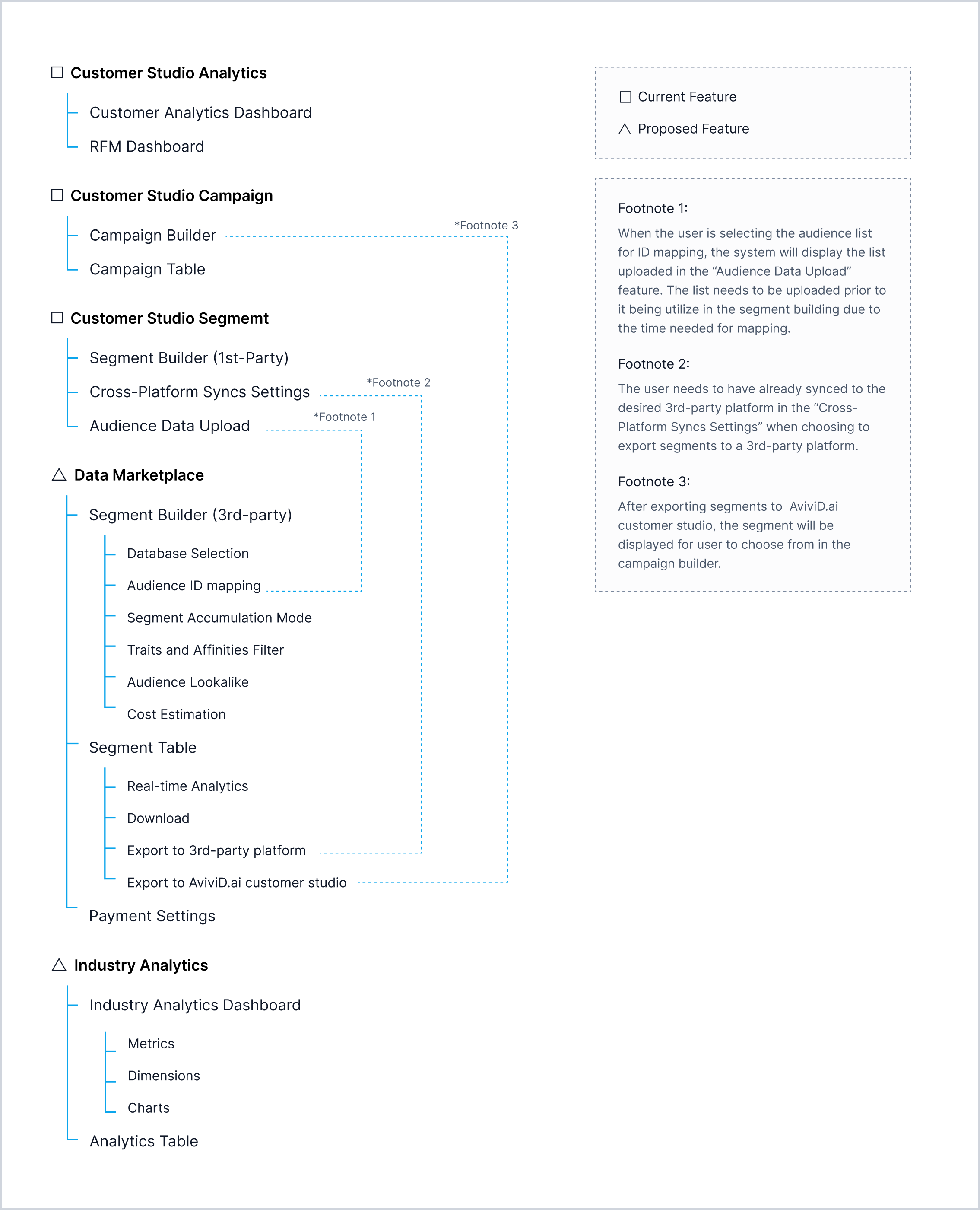
Synthesis - Site Map
With the proposed user flow, I created a sitemap that illustrates how new features integrate with and extend the existing functionality. I noted important interactions between existing and proposed features. I also kick-started a cross-functional meeting with our PM, front-end, back-end, and data engineers to discuss the noted interactions and potential bottlenecks.
Design Process - “Industry Analytics” Feature

Design - “Industry Analytics” Feature

Collect and Analyze Past Marketing Reports
Since we already had extensive historical campaign data, I proposed collecting the marketing reports our advertisers produced and using them as the foundation for our design instead of starting from scratch. By analyzing the charts in these reports, I found that most of the insights could be generated from customer traits and affinity labels already available in our system.

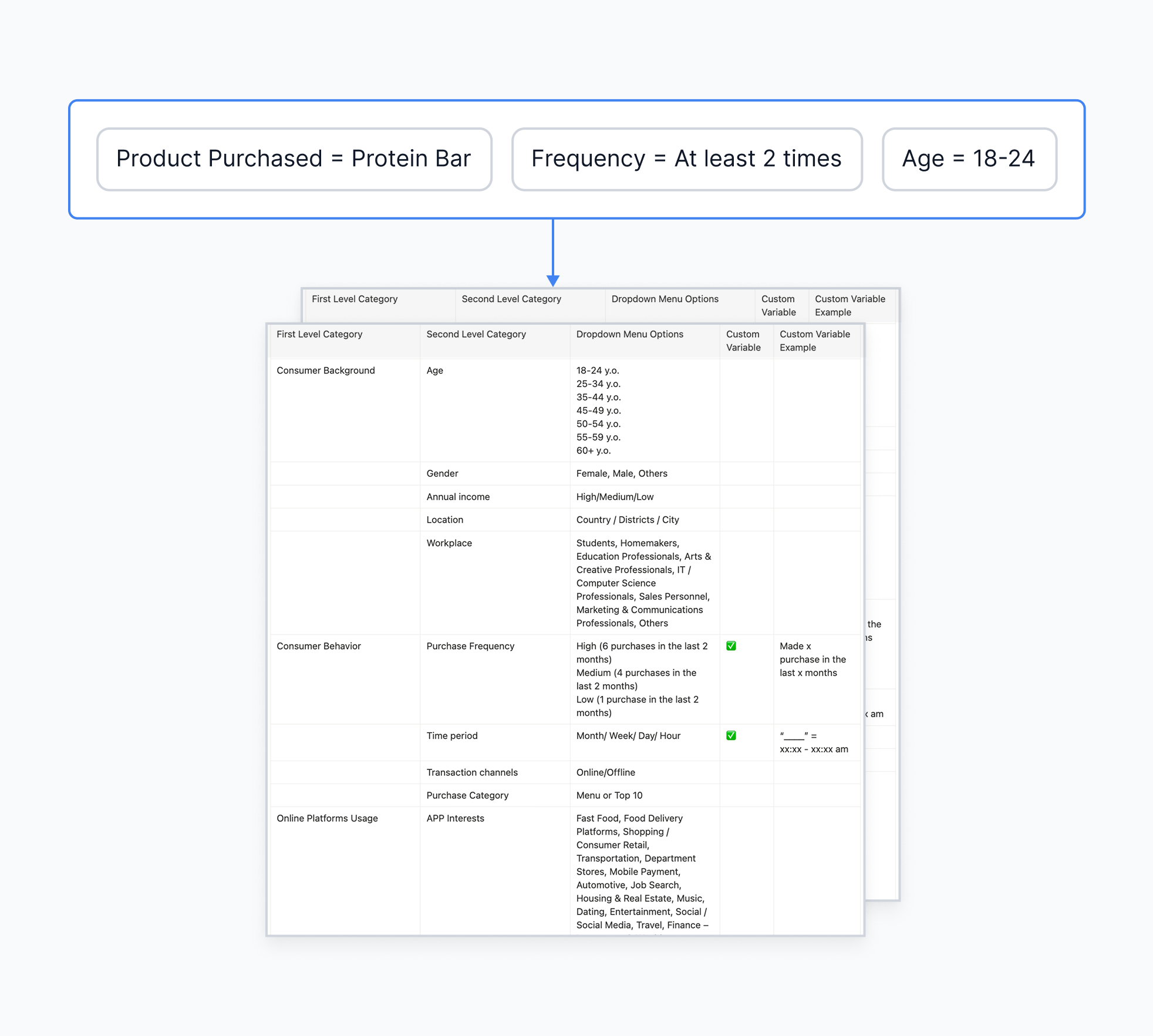
Compile All Possible Metrics and Dimensions
I requested a full list of customer traits and affinity labels from our data team and cross-referenced them with insights from marketing reports and advertiser interviews. I then compiled a unified list of both existing and newly identified labels, categorized them into dimensions (categorical) and metrics (quantitative), defined the menu options, and noted if which ones allow for custom variables.

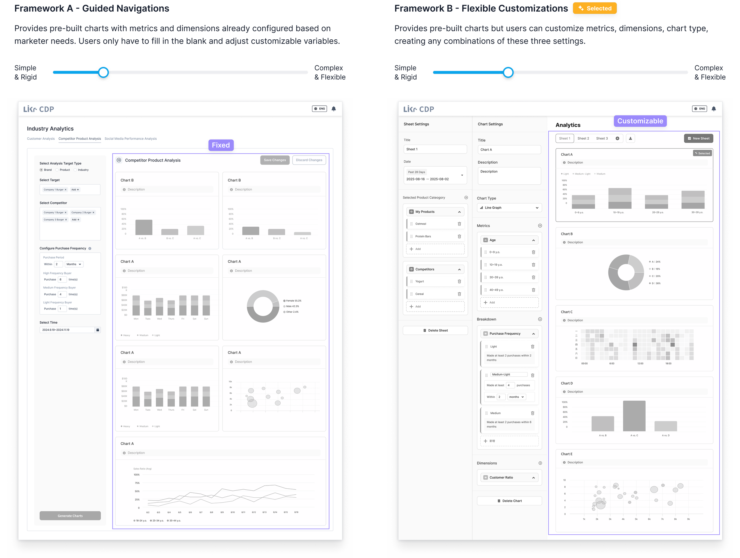
Because our advertisers vary in technical fluency, I created two framework options. Users responded best to Framework B, which balances flexibility with helpful pre-built charts.


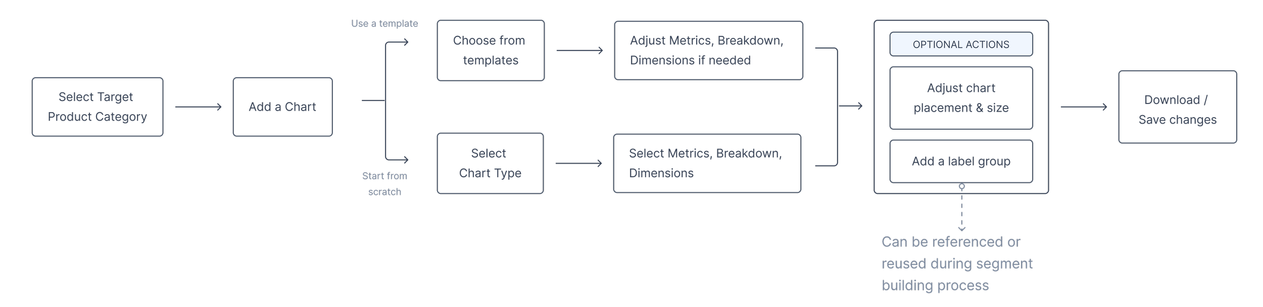
After finalizing the framework and aligning with the development team on feasibility, I completed the user flow and defined all final features.


I decided to interview advertisers to see their feedback. I iterated on the design based on the following core pain points.

Since the goal was to provide quick, accessible industry insights, I focused the final design on a guided experience rather than competing with advanced reporting tools like Looker Studio, Excel, or Tableau. I also added features that seamlessly translate these insights into our audience-building workflow.

KEY DESIGN DECISION
Provide Pre-built Charts
Catering to small-business owners, I included commonly used chart templates, giving them a starting point while still allowing flexibility to customize and explore their own analyses.

KEY DESIGN DECISION
Turn Charts into Label Groups
To integrate industry insights with the segment-building flow, I designed a feature allowing users to click on a chart segment and see how to set it up using segment boolean operators.


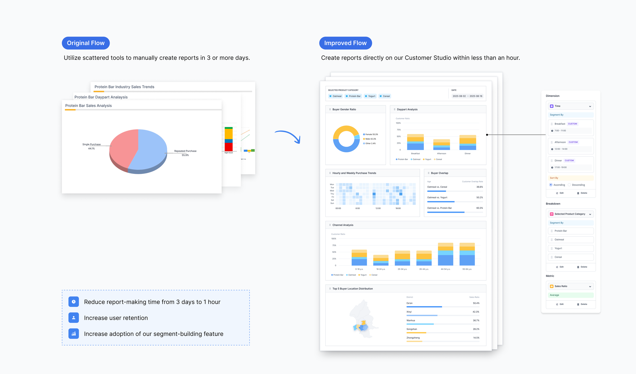
I used the prototype’s framework to create sample reports that closely matched those our advertisers typically produced. I then presented both the prototype and these sample outputs to our client, demonstrating how the new design could cut reporting time from three days to under an hour and make it far easier to translate insights directly into audience segments. I highlighted how this would improve user retention and increase adoption of our segment-building feature. After receiving approval, the prototype moved quickly into development.
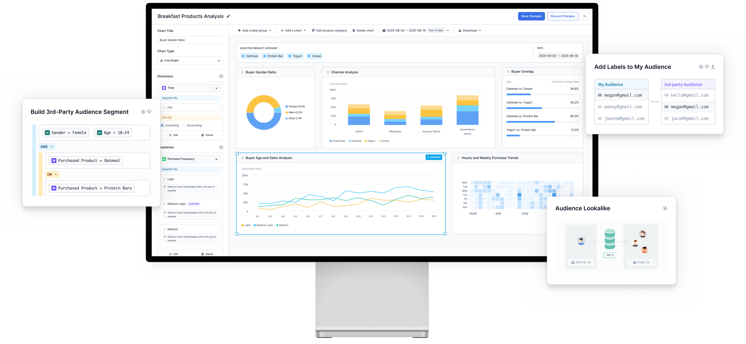
Design Process - “Data Marketplace” Feature

Design - “Industry Analytics” Feature

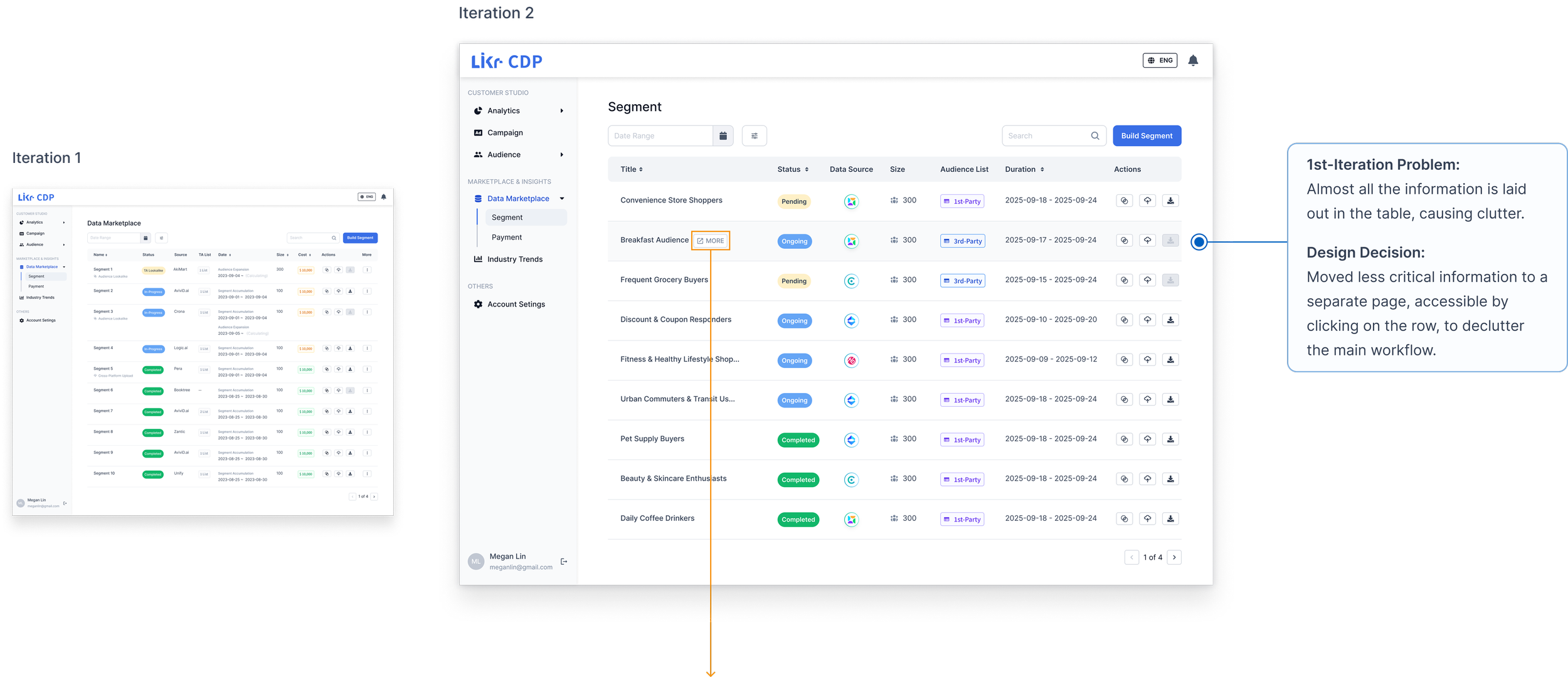
Since we already had an existing segment flow, I built on the original by adding the proposed features and simplifying complex steps into smaller, clearer ones.


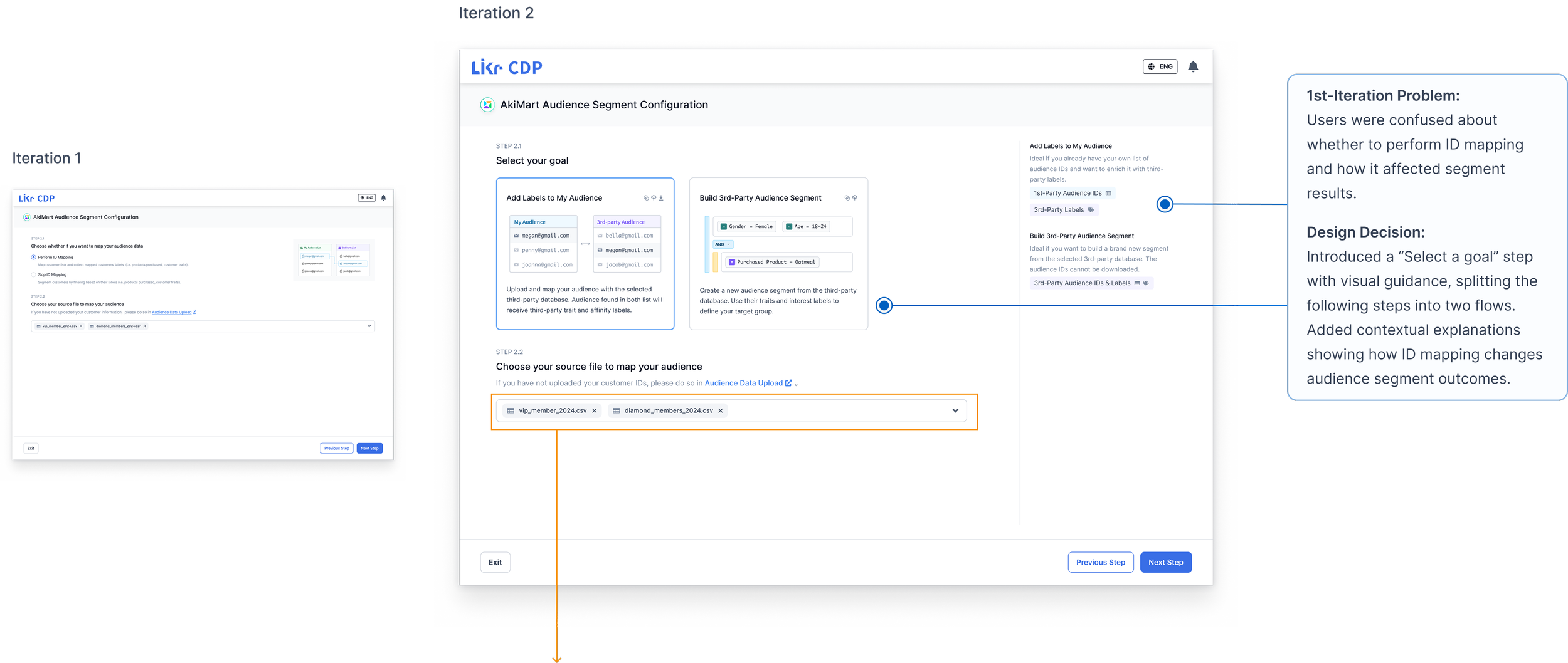
I designed the first iteration and tested it with our in-house advertisers.

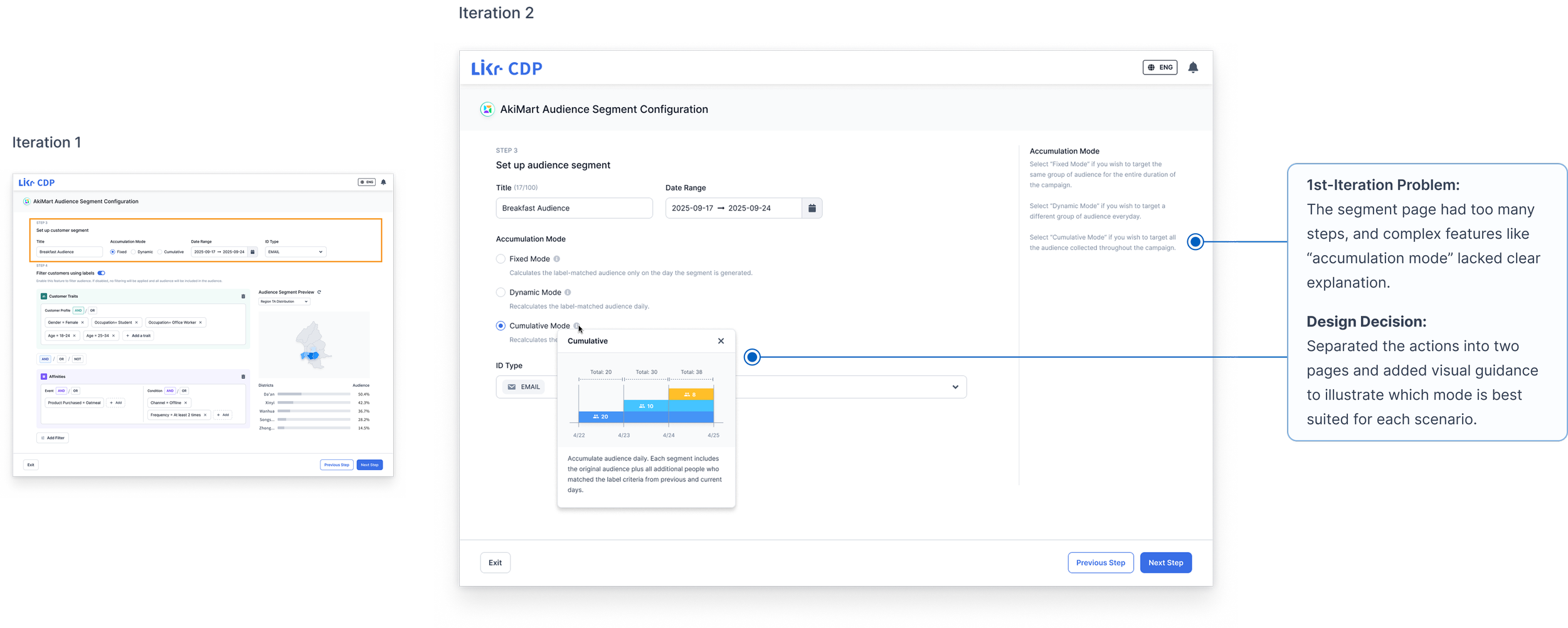
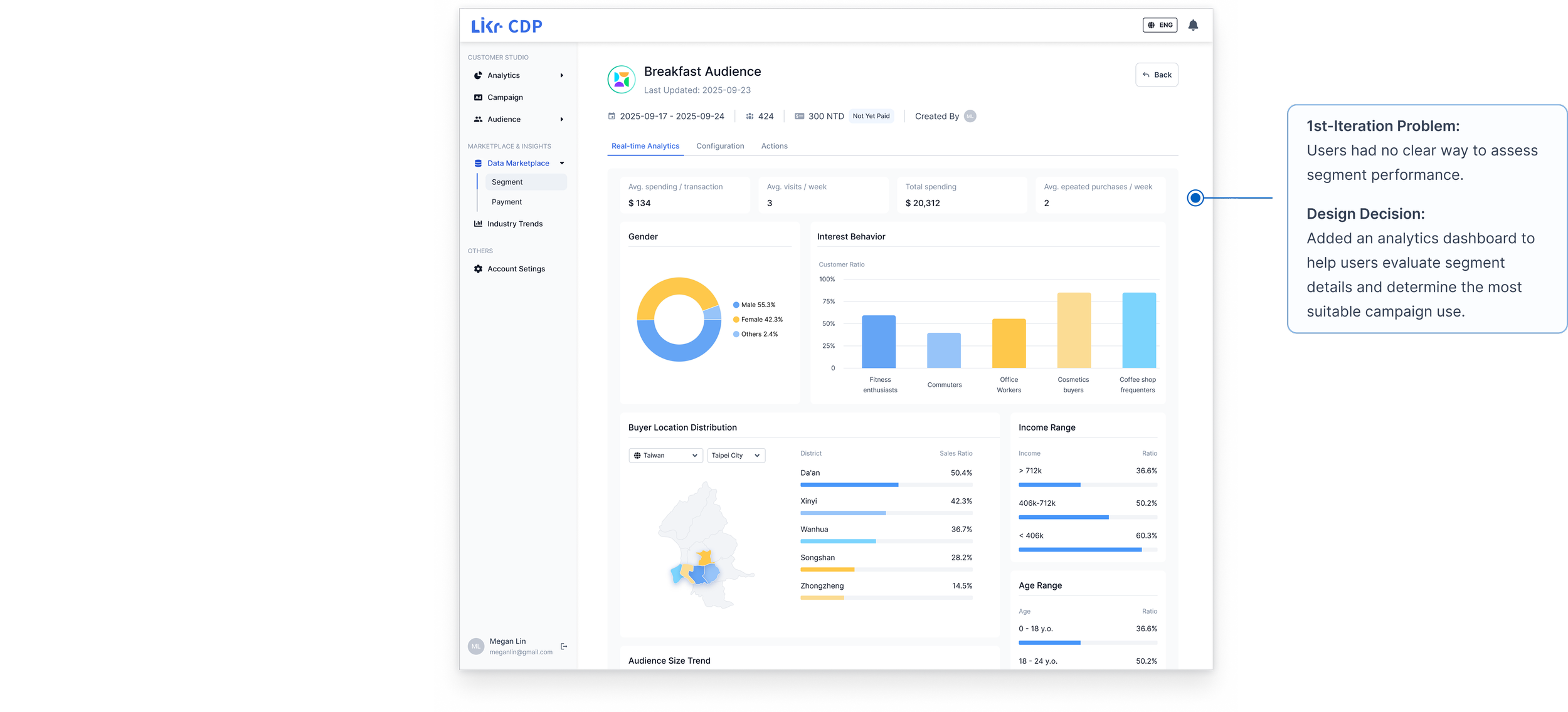
While task completion rates were high, users reported uncertainty about their setup—specifically how ID mapping, accumulation mode, and the audience lookalike feature would impact the segment.


After reviewing the flow and analyzing the user testing results, I realized that the major bottleneck lies in the “perform ID mapping” step. Users struggle to understand how this action impacts the segment. Also, since this step doesn’t influence subsequent steps, users are confused about the purpose of this step.
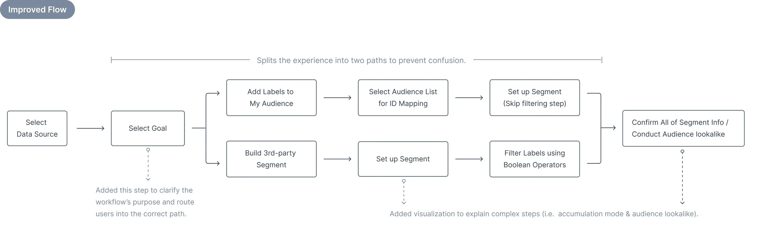
To combat this issue, I designed an extra step that asks users to choose their goal for the segment. This ensures that the users understand the different segment options. It also clearly divides the following steps into two flows, preventing mix-ups.


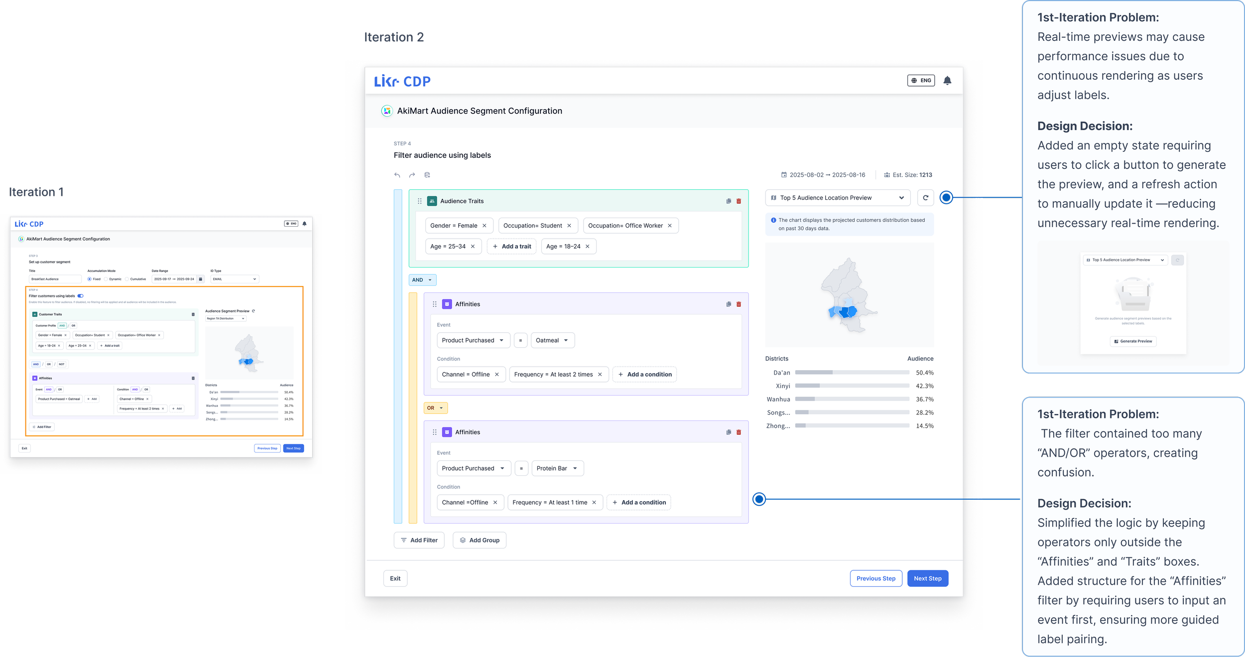


I tested the new iteration with advertisers using the think-aloud method. Although average completion time increased slightly, users demonstrated a clear understanding of each feature by reading and explaining how they were using it. Completion rates also improved, and qualitative feedback indicated the workflow was much easier to follow than the original prototype.

I partnered with product and engineering to overhaul the segment-building experience. Our redesigned prototype improved task completion by 34%. I also facilitated deep-dive sessions with engineers to align on technical constraints and prevent performance bottlenecks in both backend processing and the user experience.
Team’s Success
Through this project, I learned how to build a SaaS tool and design system from the ground up. One thing I would approach differently next time is integrating AI agents. I identified several moments where an agent could provide value—such as recommending charts, suggesting segment logic, or estimating segment size. However, after evaluating feasibility with engineering, we determined that including these features would significantly delay the project. If we had more time and resources, exploring AI-driven assistance would have been a key next step.”
Reflections