
Project Details
Timeline: September 2020 - May 2022
Role: UX Designer & Engineering Team Lead
Organization: CMU HCI Institute
Team: Advisors, Engineers, and UX designers
Project Overview
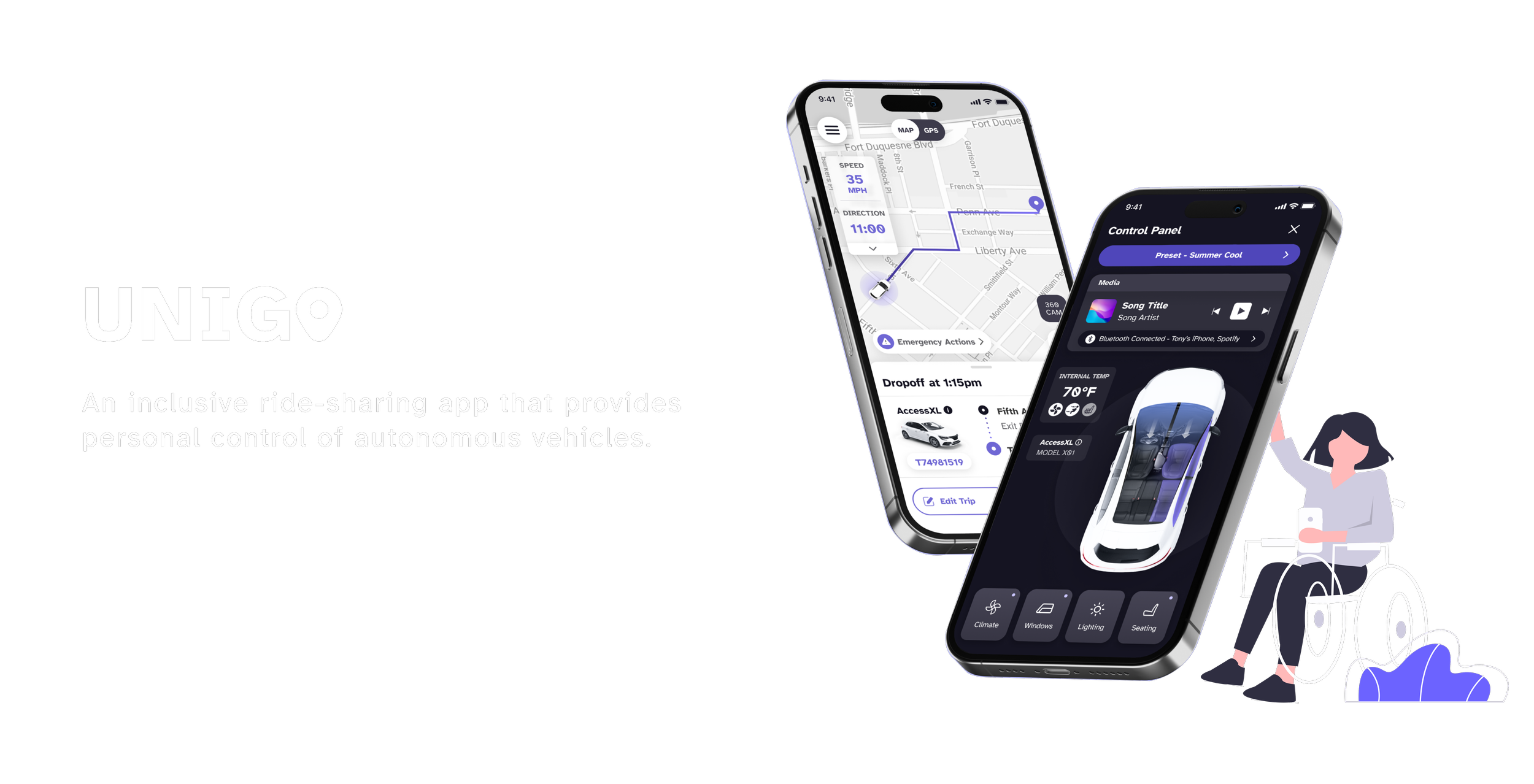
The U.S. Department of Transportation’s Inclusive Design Challenge sought to inspire new ways for automated vehicles to better serve people with disabilities. As a semifinalist team from Carnegie Mellon University Human-Computer Interaction Institute, we designed a mobile-based vehicle control interface that balances delight with trust, giving users intuitive control while reinforcing a sense of safety and confidence throughout the ride experience.

The Challenge
Vehicle Control Interface Lacks Accessibility
Autonomous vehicles (AVs) have the potential to provide independence and freedom to people with disabilities. However, existing ridesharing apps lack a variety of communication modes and control interfaces that are accessible to all people.


The Solution
Unigo: Personalized and Inclusive Controls

Primary Research
Survey + User Interviews
We sent out surveys and conducted directed storytelling interviews with individuals and focus groups to understand users’ pain points from the order-ride stage to the drop-off stage of the ride.


Synthesis
We synthesized our research using an affinity diagram and found clear patterns across participants. Users consistently wanted:
An efficient and reliable communication system
Accessible features that assist passengers throughout the ride
Freedom to control vehicle and ride settings
Capturing Key Themes

With the insights from the affinity map, I worked with my team to create a user journey map that shows how our users often found it difficult to customize the car's environment.
Identifying Opportunity Gaps


Summary of Insights


Design Question
“How might we design an inclusive system for autonomous vehicles with personalized controls?”
Conceptual Design
Visualize the System and Controls
With the problem statement in mind, I suggested moving communication and control to users’ smartphones. Users’ familiarity with their own devices eliminates the learning curve needed for using new technologies.
More importantly, this solution allows us to leverage the built-in accessibility features of their smartphones and provide a consistent, intuitive ride-share experience on all types of vehicles.


Mobile App Design Guidelines
Enabling Full Navigation and Control on User’s Personal Device
With the conceptual model in mind, we compiled key points from the WCAG guidelines and incorporated accessible controls into the wireframes.

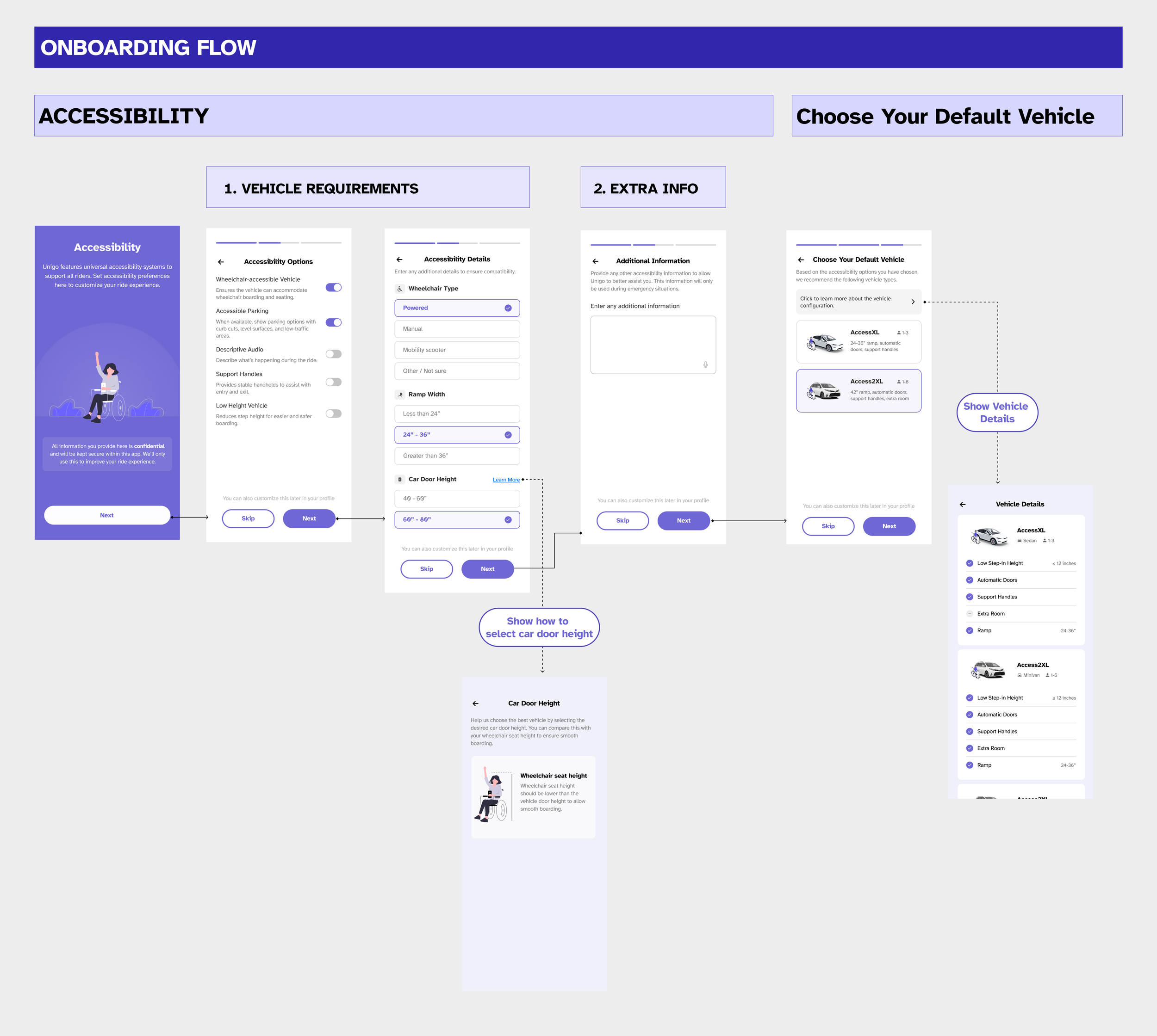
First Iteration: Reducing the Outbound from Onboarding
To shorten the onboarding flow, we limited questions to only those that directly influence ride personalization. This reduced completion time while ensuring users clearly understand how their responses affect vehicle selection and accessibility options. However, user testing revealed that the flow still felt confusing, as several screens required users to click into nested elements to perform additional actions, resulting in a non-linear and less intuitive experience.
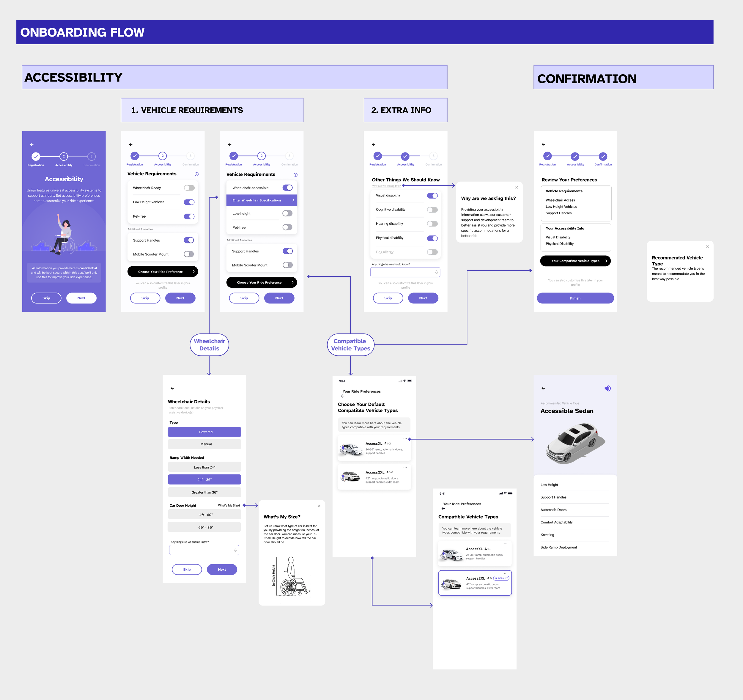
Wireframes: Providing Onboarding Customizations
To support users with varying capabilities, I designed preference-setting screens that allowed riders to specify accessibility needs and save presets for future trips. During wireframe reviews and user interviews, many participants expressed hesitation about entering personal information, even when we assured them of confidentiality.
This feedback prompted me to ask a key question to the team: “How will each data point be used to personalize the ride experience?” That discussion revealed that several questions did not meaningfully influence personalization and could be combined or removed, leading to a more streamlined onboarding experience.
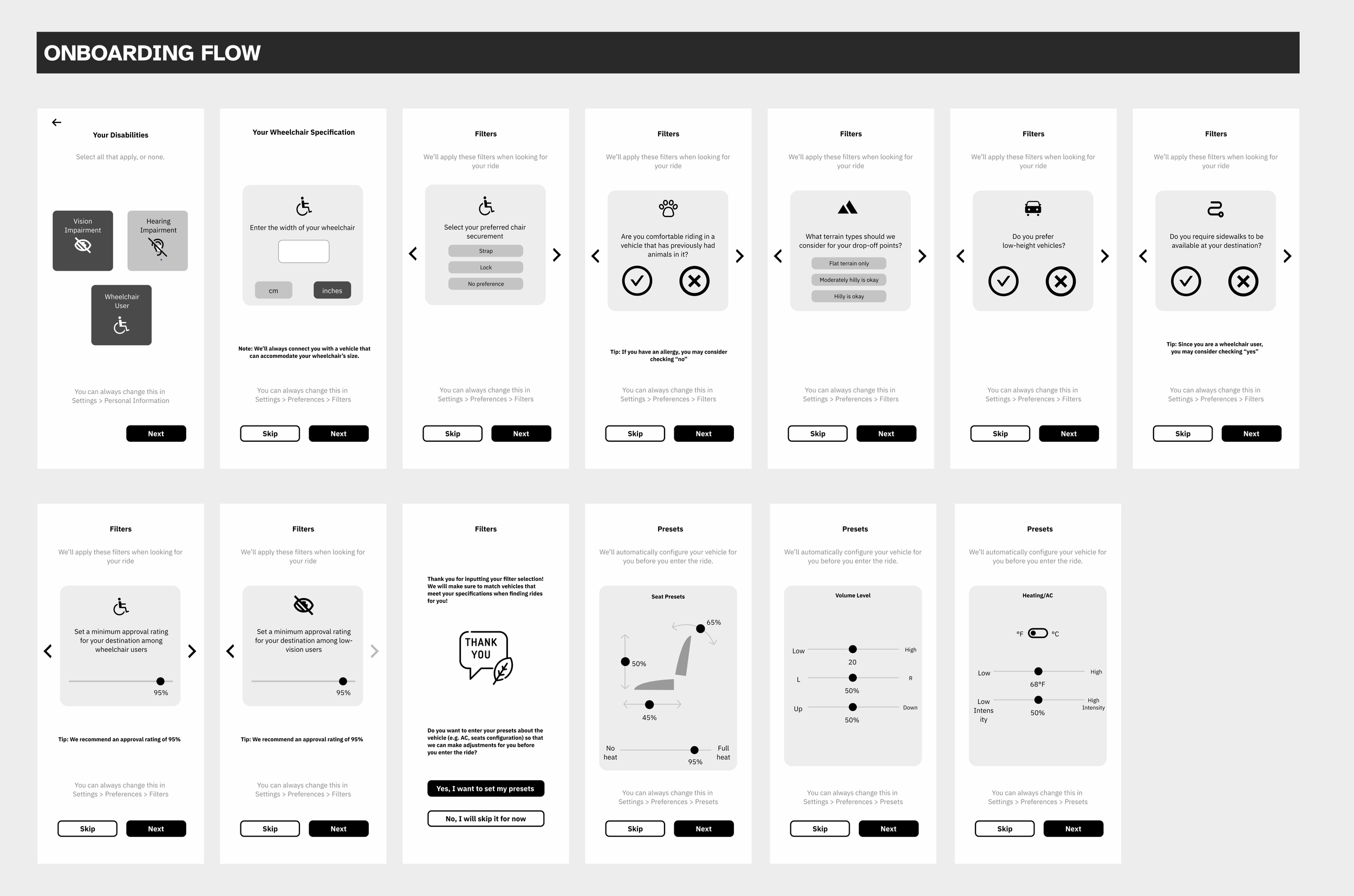
Mobile App Design: Onboarding Flow
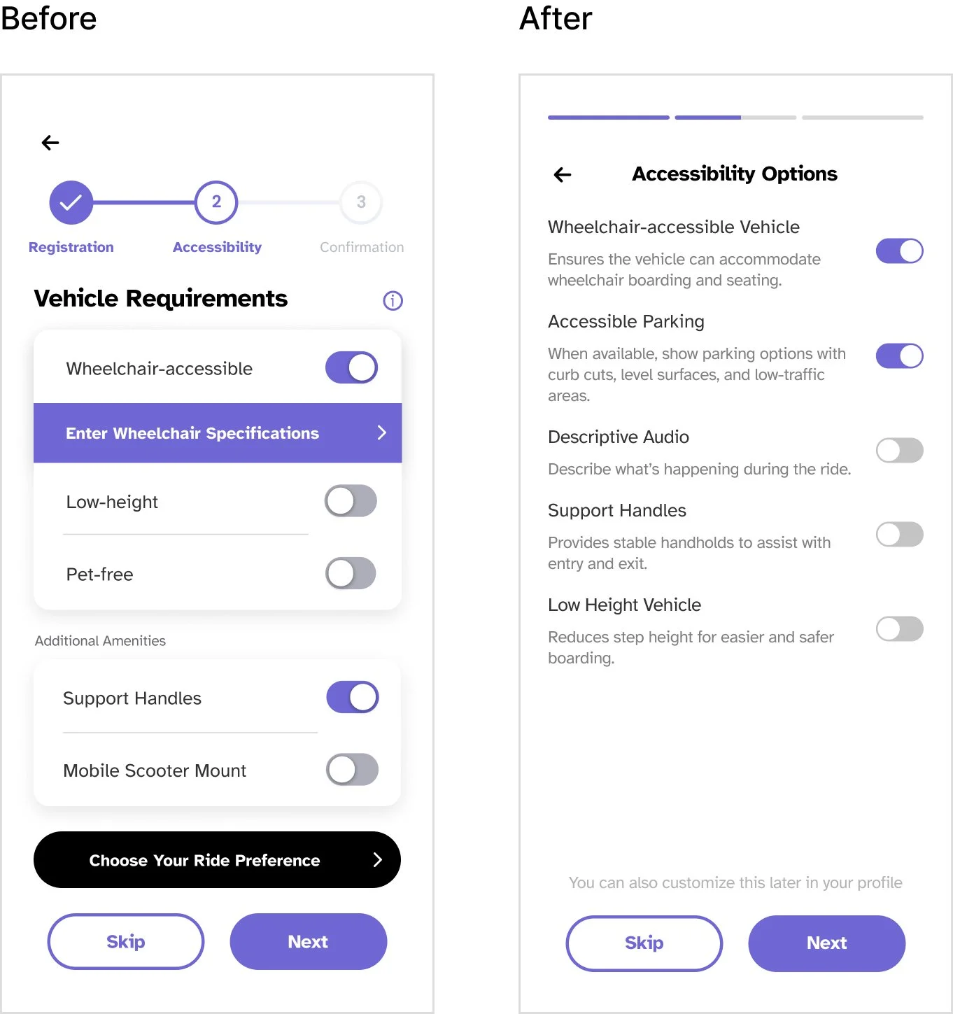
Key Design Change #1
As I refined the experience, I made sure each accessibility option included clear helper text, so users understood exactly what would happen when they toggled a setting on.
I also simplified the UI by tightening the text hierarchy and removing unnecessary visual noise, and introduced an accessible parking option after learning that users with limited mobility often feel anxious about orienting themselves on the street, especially when navigating slopes or uneven surfaces.
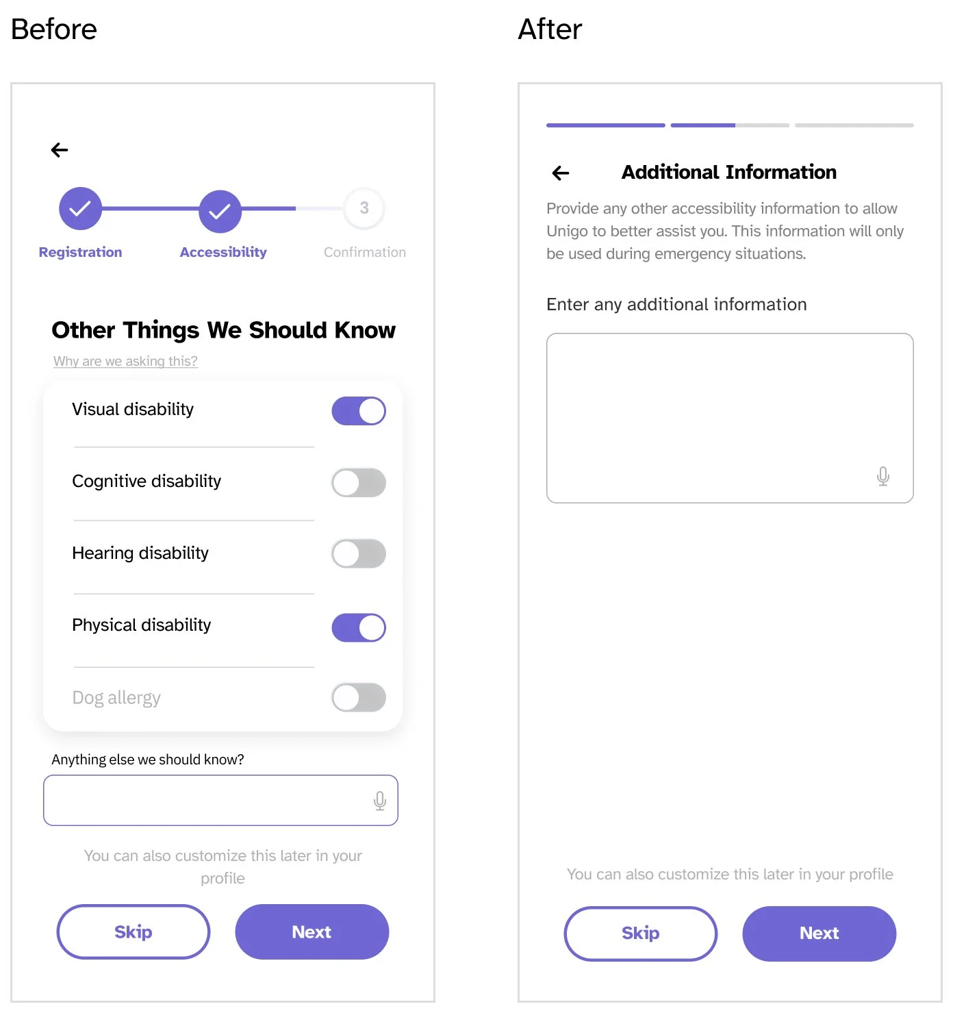
Key Design Change #2
Through research, it became clear that direct questions about disability could feel invasive. In response, I replaced binary disability toggles with an optional, open-ended input and set clear expectations around emergency-only use, prioritizing trust and user agency.
Key Design Change #3
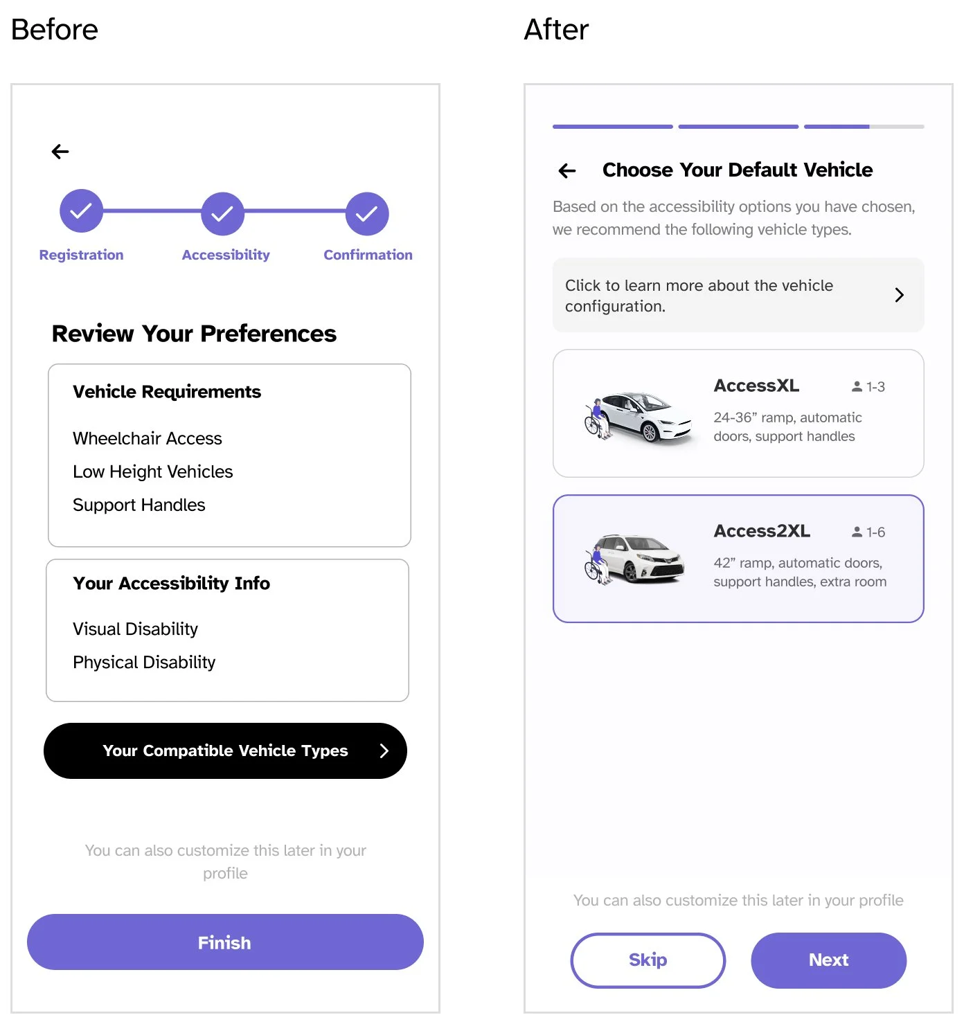
I noticed that asking users to review and confirm their preferences early in the flow didn’t actually help them understand how the system worked—it only made onboarding longer. Instead, I removed that step, moved vehicle selection to the end of onboarding, and let the system curate recommendations based on user preferences, making the personalization more tangible and easier to understand.
Second Iteration: Redesign for Linear Progression
To address the confusion in the flow, I stepped back and looked at how users were actually moving through the screens. I realized that asking users to click into multiple elements to complete related actions was breaking their sense of progress.
In response, I redesigned the flow to create a more linear progression. Each screen presents all necessary inputs upfront, allowing users to make decisions in one place without hidden steps. I also replaced the final “review and confirm” moment with a personalized vehicle recommendation, helping users immediately see how their inputs translated into a tangible outcome and reinforcing the value of sharing their preferences.

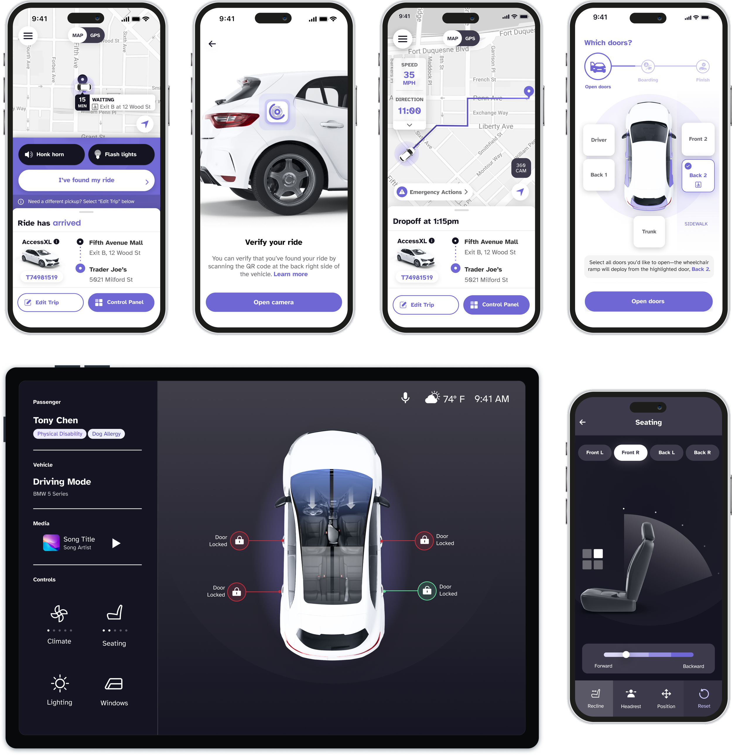
Removing uncertainty at the moment of boarding
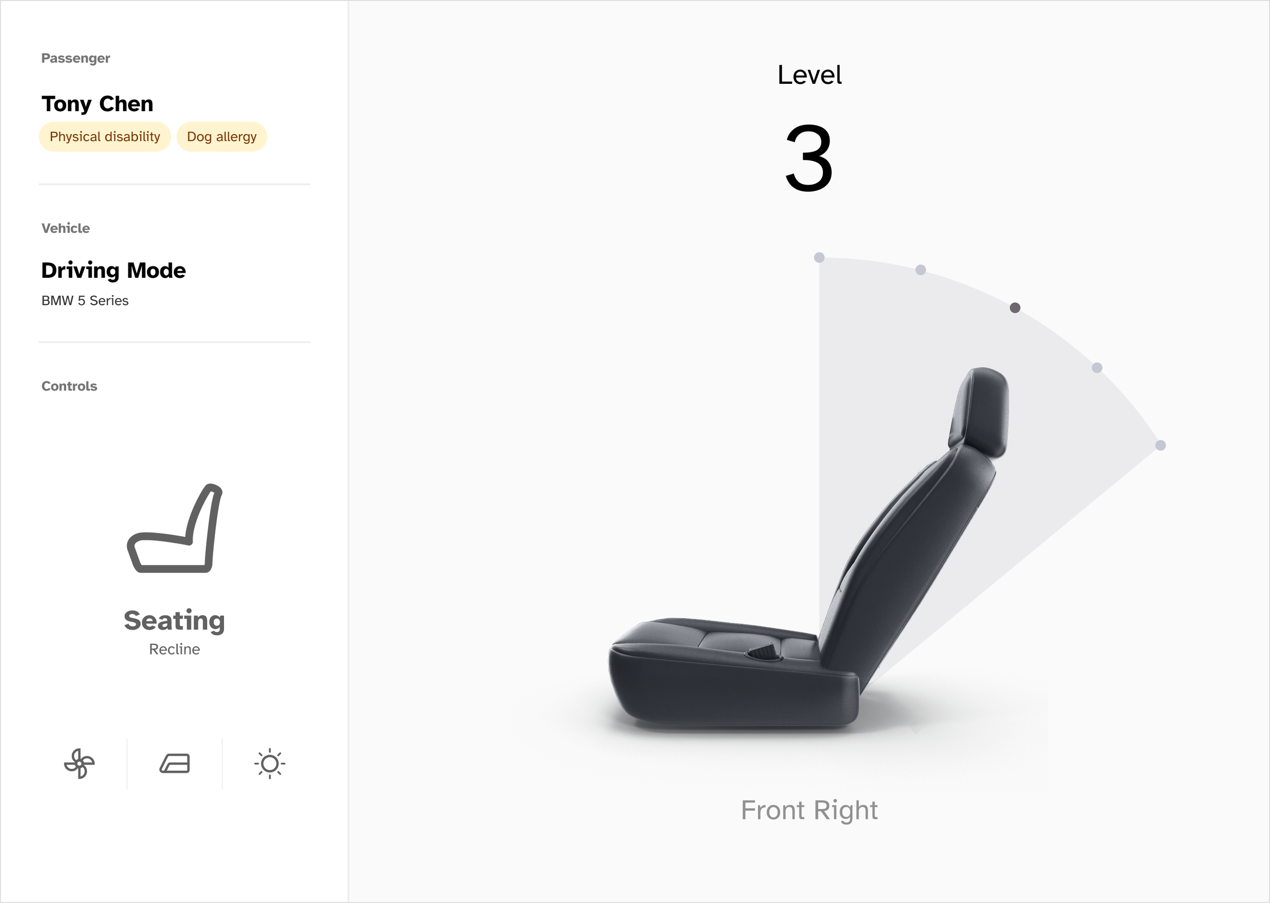
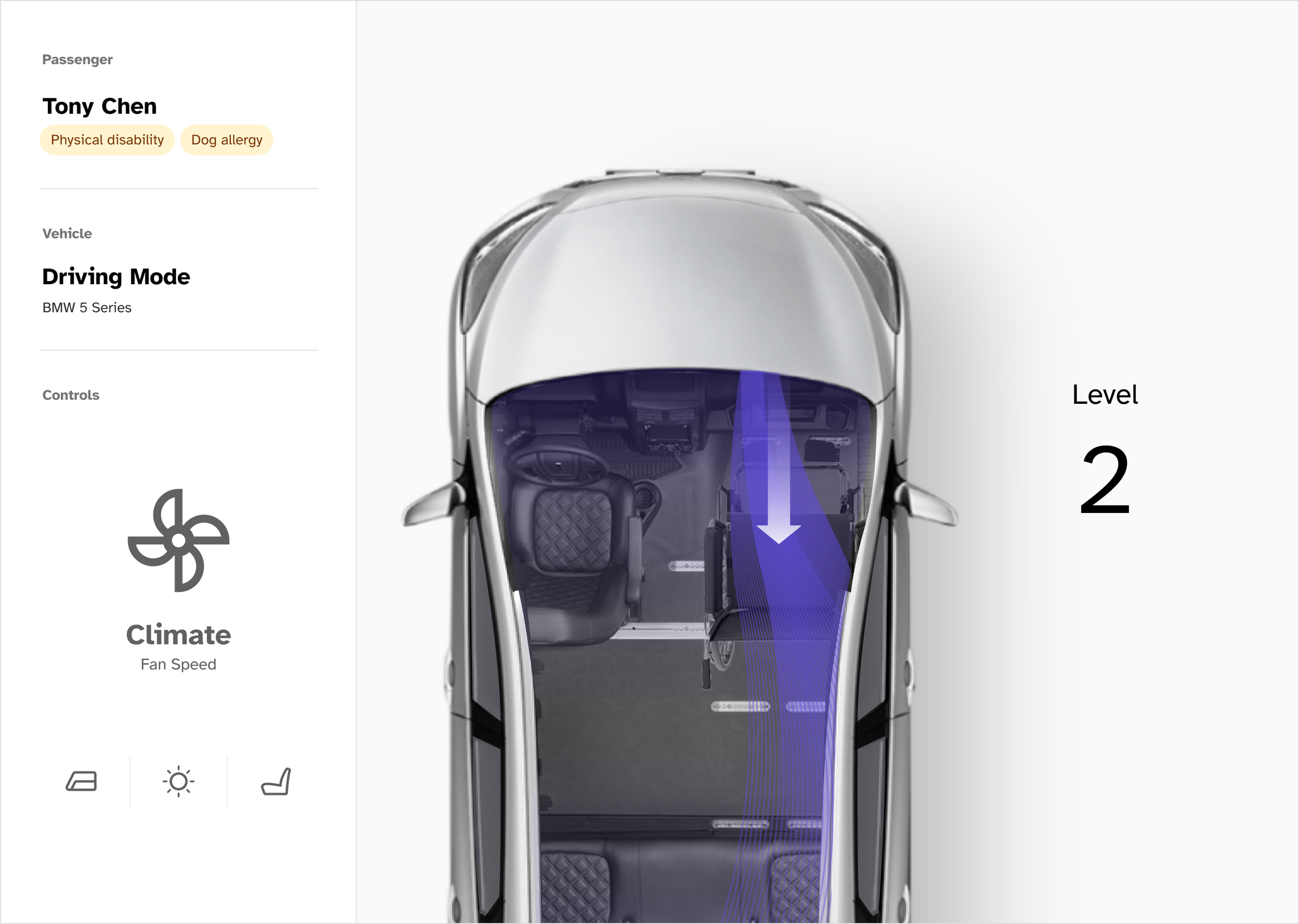
To support a smooth and stress-free boarding experience, I designed a dedicated boarding flow that gives users clear, high-confidence controls at the moment they need them most. I surfaced prominent, easy-to-tap buttons for actions like deploying the ramp, reducing ambiguity and minimizing time pressure during boarding. To account for users with visual impairments or low vision, I also added options to trigger the vehicle’s flashlight or honk, helping users quickly locate the car in busy or unfamiliar environments. Together, these decisions ensured the boarding experience felt intuitive, accessible, and supportive across a wide range of abilities.
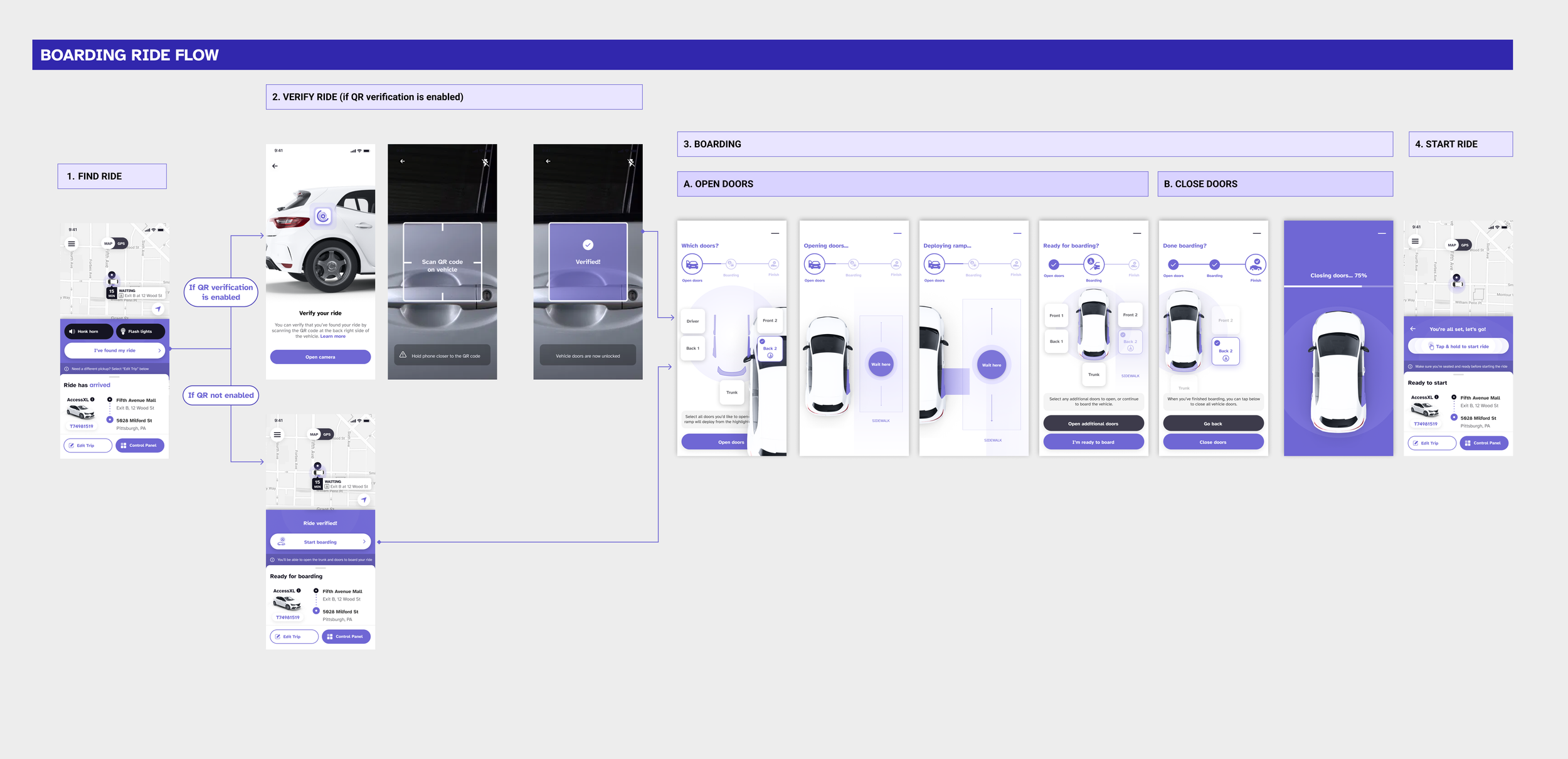
Mobile App Design: Boarding & Dropoff Flow
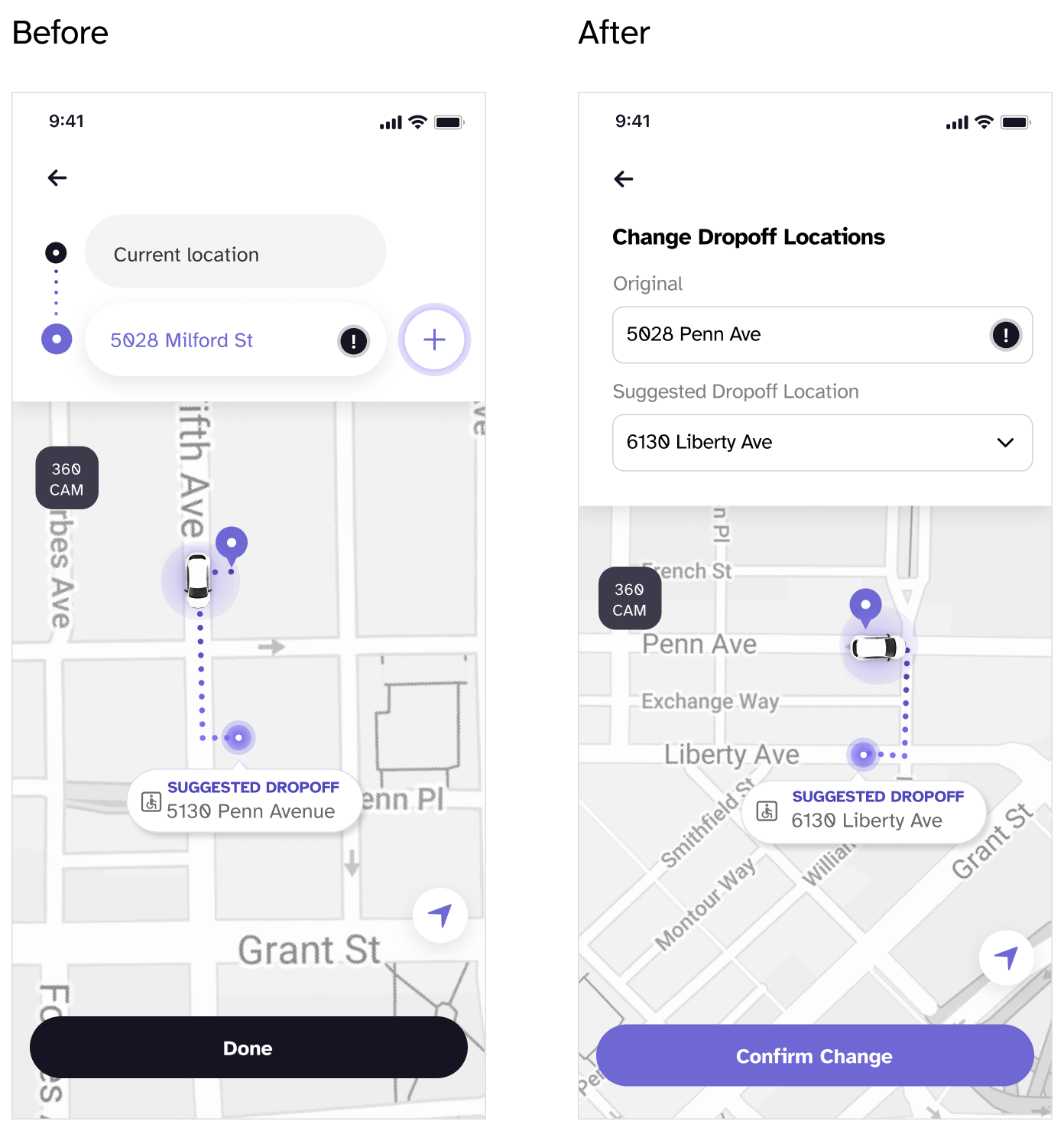
Reducing ambiguity when editing drop-off locations
During refinement, I noticed users were unsure whether they were viewing or editing a drop-off location, so I introduced helper text to make that distinction explicit.
This small change reduced ambiguity and helped users act with confidence in a high-stakes moment.
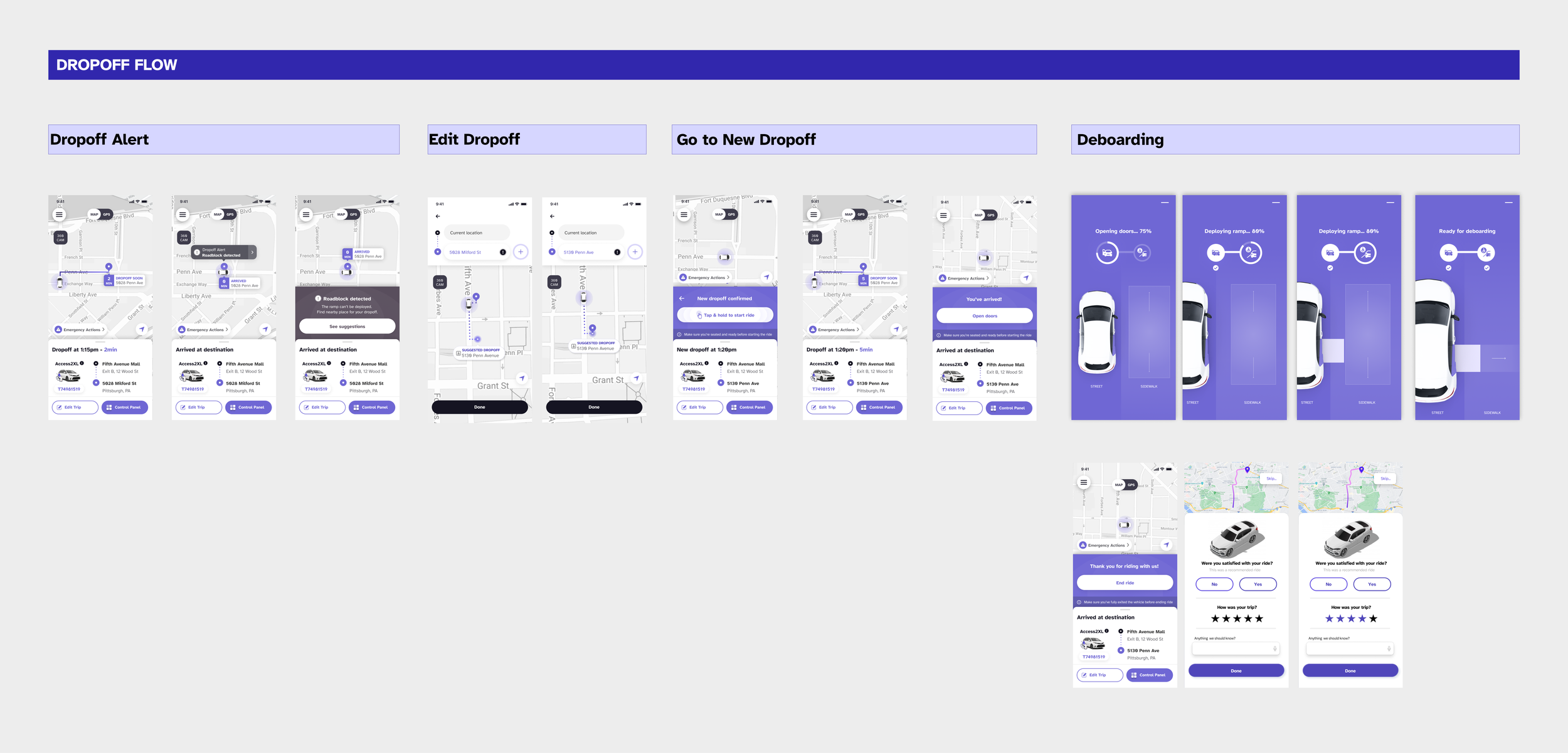
Planning for the unexpected at drop-off
I designed the drop-off flow with real-world uncertainty in mind, accounting for scenarios where accidents or roadblocks could make the original drop-off location unsafe or inaccessible. To support these moments, I introduced an emergency reroute option that allows users to quickly select an alternative location that avoids obstructions and steep slopes. By surfacing safer, level drop-off options when conditions change, the flow helps ensure wheelchair users can deboard with greater confidence and safety, even in unexpected situations.
Simulator Web App Design
Understand Controls and Feedback with a User Flow Diagram
After working on the mobile app, I switched to investigating a new challenge. How can we build a system to test the mobile app without an autonomous vehicle?
To ideate a solution, I created a user flow diagram to indicate what user action would trigger a response that can be displayed on a “simulator” that mimics the car environment. For example, based on users’ preference selection, the simulator would display the corresponding vehicle approaching the pick-up location.
Based on the user flow diagram, I led the simulator team to iterate on the simulator design that conforms to the WCAG accessibility guidelines. I decided to design and develop an interface that simulates the riding environment and provides feedback to the users as they play with the mobile app.

Design a Dashboard that Provides Visual and Auditory Feedback

Final Prototype
Mobile App


Simulator Dashboard


Reflection
Accessibility starts with strong fundamentals
Although this project focused on accessibility, I learned that accessibility alone doesn’t guarantee a good experience. Especially in a consumer onboarding flow, fundamentals like clarity, pacing, and feedback matter just as much. Designing for accessibility pushed me to be more disciplined about hierarchy, flow, and intent—reminding me that inclusive experiences only work when the underlying design is solid.